
https://drive.google.com/file/d/17C7FbPDedoY65GazAVRhqi-WMs84np6k/view?usp=sharing
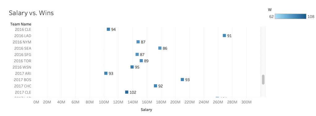
For the first chart showcasing team salary (payroll) vs wins I was able to find an interesting pattern. It appears that the higher the team salary the more wins they get. Teams that had wins over 82 or more usually fell above a salary of 140 million dollars. Also filtering for a maximum ERA of a 4.0 showed that teams with a higher payroll usually have a lower ERA and higher wins.This chart taught me that teams with higher payrolls usually have more wins.
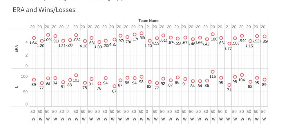
The second chart showed the relationship between team ERA and Wins/Losses. This was then filtered by teams who had a minimum home run total of 200 home runs. The data showed that teams who had a higher ERA usually had a greater amount of losses. By filtering the chart by home runs we are able to show that if you combine at least 200 home runs with a lower ERA you are more likely to win a greater amount of games. However, if you have 200 home runs and a higher ERA it is still likely that you wont win many games. This questions the impact of home runs on a teams total wins. This chart taught me that if you have a lower ERA you are more likely to win more games if you have at least 200 home runs.
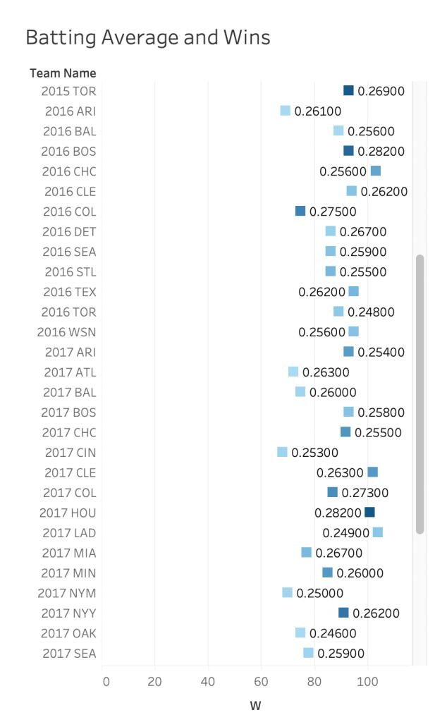
Next, for the third chart the relationship between team batting average and team wins is tested. The data was also filtered by teams having a minimum of RBI’s (runs batted in) of 700. When you look at the data you are able to see a distinct relationship between higher batting average and more wins. Teams that have lower batting averages often had fewer wins (less than 80). Filtering the data by teams having at least 700 RBI’s helped show that teams with higher batting averages and higher runs batted in often win more games than teams who don’t score 700 runs. This taught me that teams with higher batting average and more RBI’s usually yields more wins.
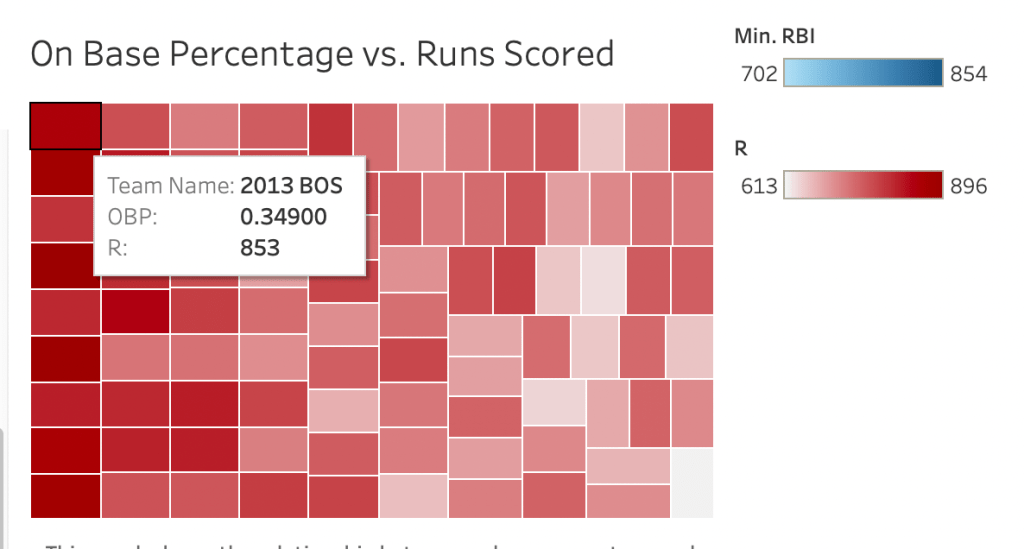
Finally, for the fourth chart the relationship between OBP (On base percentage) and runs scored is established. It is also filtered by teams having a minimum batting average of over .255. This chart shows that teams who have a batting average above a .255 all have an OBP of over a .300. This is significant because it shows that the more a team hits the more likely they are to have players on base. Having more players get on base is directly correlated to scoring more runs. This final chart taught me that teams with a higher on base percentage scored more runs.
To conclude, this Tableau experiment helped explore my research question “Which baseball statistic is the largest factor in determining amount of wins?”, if there is even one statistic that can prove this at all. Through creating the four charts I was able to determine it is not a specific statistic that is the greatest factor in determining amount of wins but actually a combination of statistics. A combination of team payroll, ERA, batting average, RBI’s, and on base percentage are all very important when trying to predict team wins.
